UX / Concept / UI
Distriktstandvården is a Stockholm-based dental company. Me and my team at Hyper Island were asked to improve the digital experience in order to increase Distriktstandvården patient base.
We performed desktop research and in-depth interviews with costumers. Analyzing the results from the research we saw that the current booking process made the users feel confused and out of control.
We collected possible problems. Weak CTA, tedious booking fields, confusing information hierarchy and no options for non-swedish speakers.
Based on these hypothesies, we came up with possible solutions:
- Clear call to action
- Conversational interface
- Only show available times
- Option to go back
- Auto populate fields for speed
- Clear confirmation
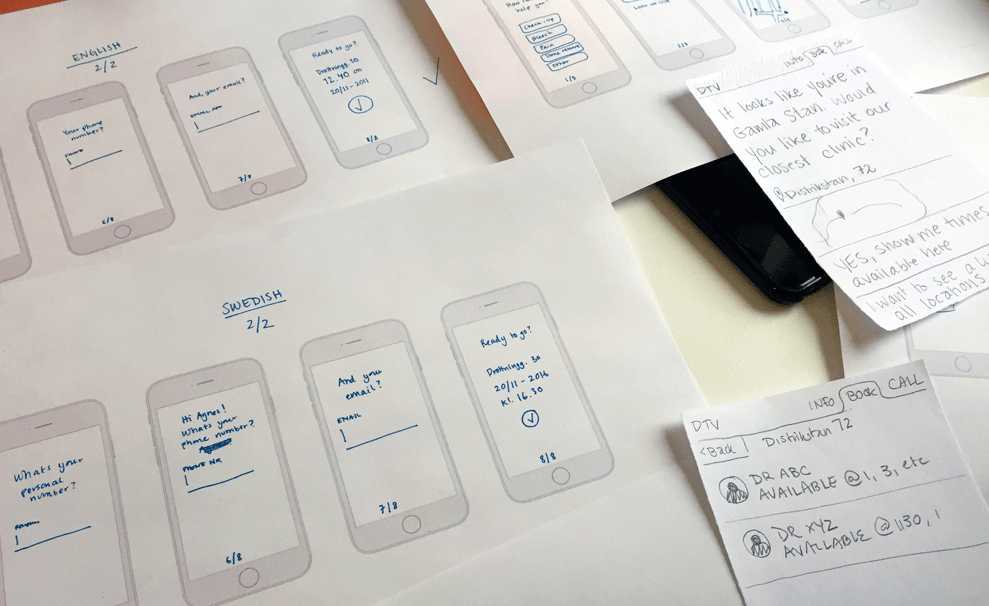
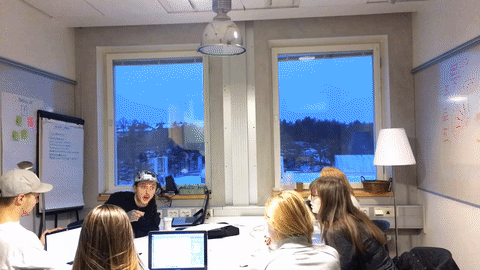
After some initial experimentation, we created a structured and fast-paced model for prototyping. For 20 minutes, we worked independently on different sections of the user flow. We’d then reconvene and spend 5 minutes per person to present our latest draft to the rest of the team and receive feedback. After 4 sprint and feedback cycles, we brought the different pieces of the prototype together in digital form.
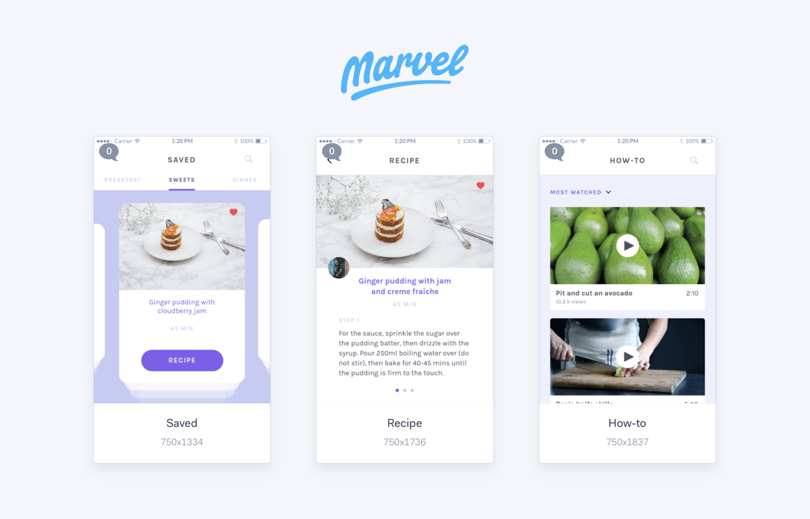
To validate our design decisions and make the user flow as intuitive and friendly as possible, we built an interactive prototype and tested it with potential customers in 3 feedback and iteration cycles. For this we used Marvel and Lookback.

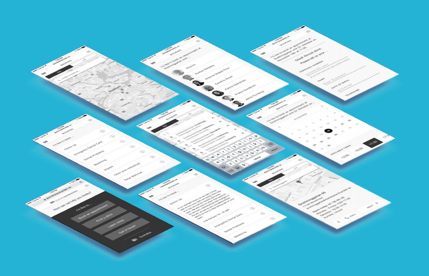
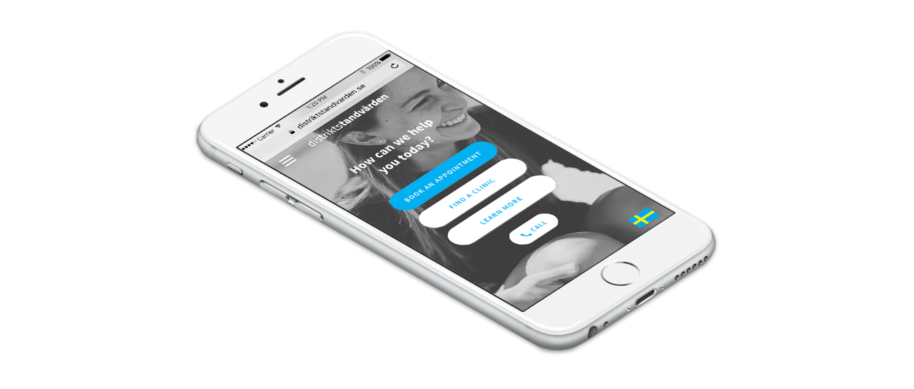
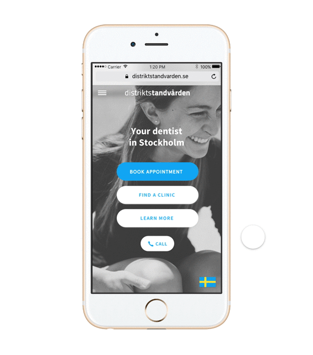
After delivering the wireframes to the client, I played around with potential visual design.
 A big thanks to my team; Katrine Bimell, Clara Braddick, Daniel Montano, Aleksandra Szymczak and Sebastian Østgaard.